Lightbox
Bootstrap 5 Lightbox component
Responsive lightbox built with the latest Bootstrap 5. Lightbox is a responsive gallery with the option to enlarge selected photos.
MDB lightbox is a group of images combined in one responsive gallery. Elements are grouped in a thumbnail grid, which can be displayed as a slideshow.
Note: Read the API tab to find all available options and advanced customization
Basic example
A basic example of a lightbox with the most common use case with the bootstrap grid.


            <div class="lightbox">
              <div class="row">
                <div class="col-lg-4">
                  <img
                    src="https://mdbcdn.b-cdn.net/img/Photos/Thumbnails/Slides/1.webp"
                    data-mdb-img="https://mdbcdn.b-cdn.net/img/Photos/Slides/1.webp"
                    alt="Table Full of Spices"
                    class="w-100"
                  />
                </div>
                <div class="col-lg-4">
                  <img
                    src="https://mdbcdn.b-cdn.net/img/Photos/Thumbnails/Slides/2.webp"
                    data-mdb-img="https://mdbcdn.b-cdn.net/img/Photos/Slides/2.webp"
                    alt="Winter Landscape"
                    class="w-100"
                  />
                </div>
                <div class="col-lg-4">
                  <img
                    src="https://mdbcdn.b-cdn.net/img/Photos/Thumbnails/Slides/3.webp"
                    data-mdb-img="https://mdbcdn.b-cdn.net/img/Photos/Slides/3.webp"
                    alt="View of the City in the Mountains"
                    class="w-100"
                  />
                </div>
              </div>
            </div>
Image optimization
To ensure the proper performance of the page, it is recommended to include thumbnails of
images in the src attribute. Then in the
data-mdb-img attribute add the path to the image with higher resolution. If the
data-mdb-img attribute is omitted, the lightbox will display the same image as in
the reduced size.
            <img
              src="https://mdbcdn.b-cdn.net/img/Photos/Thumbnails/Slides/1.webp"
              data-mdb-img="https://mdbcdn.b-cdn.net/img/Photos/Slides/1.webp"
              alt="Table Full of Spices"
              class="w-100"
            />
Shadows and rounded corners
You can improve the look of the images by adding shadows and rounded corners.
            <div class="lightbox">
              <div class="row">
                <div class="col-lg-4">
                  <img
                    src="https://mdbcdn.b-cdn.net/img/Photos/Thumbnails/Slides/1.webp"
                    data-mdb-img="https://mdbcdn.b-cdn.net/img/Photos/Slides/1.webp"
                    alt="Table Full of Spices"
                    class="w-100 shadow-1-strong rounded"
                  />
                </div>
                <div class="col-lg-4">
                  <img
                    src="https://mdbcdn.b-cdn.net/img/Photos/Thumbnails/Slides/2.webp"
                    data-mdb-img="https://mdbcdn.b-cdn.net/img/Photos/Slides/2.webp"
                    alt="Winter Landscape"
                    class="w-100 shadow-1-strong rounded"
                  />
                </div>
                <div class="col-lg-4">
                  <img
                    src="https://mdbcdn.b-cdn.net/img/Photos/Thumbnails/Slides/3.webp"
                    data-mdb-img="https://mdbcdn.b-cdn.net/img/Photos/Slides/3.webp"
                    alt="View of the City in the Mountains"
                    class="w-100 shadow-1-strong rounded"
                  />
                </div>
              </div>
            </div>
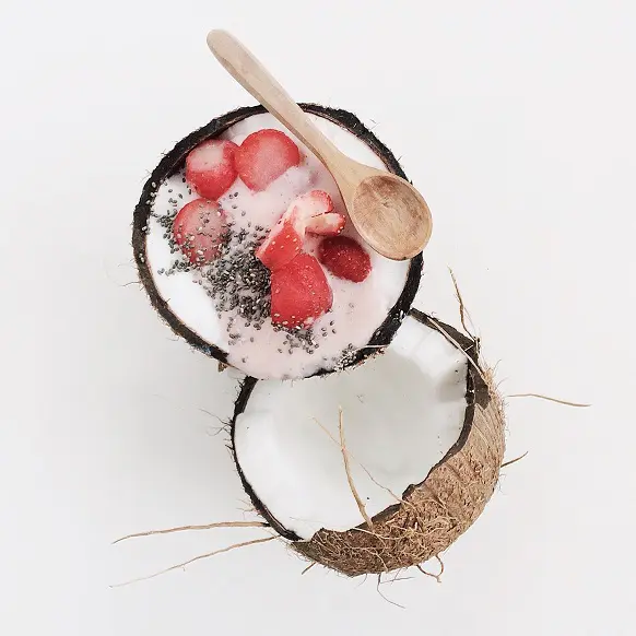
Different sizes
Loaded images can have any aspect ratio. Their size will be automatically adjusted to the window when you open the lightbox.

            <div class="lightbox">
              <div class="row">
                <div class="col-lg-6">
                  <img
                    src="https://mdbcdn.b-cdn.net/img/Photos/Thumbnails/Slides/1.webp"
                    data-mdb-img="https://mdbcdn.b-cdn.net/img/Photos/Slides/1.webp"
                    alt="Table Full of Spices"
                    class="w-100 mb-2 mb-md-4"
                  />
                  <img
                    src="https://mdbcdn.b-cdn.net/img/Photos/Thumbnails/Square/1.webp"
                    data-mdb-img="https://mdbcdn.b-cdn.net/img/Photos/Square/1.webp"
                    alt="Coconut with Strawberries"
                    class="w-100"
                  />
                </div>
                <div class="col-lg-6">
                  <img
                    src="https://mdbcdn.b-cdn.net/img/Photos/Thumbnails/Vertical/1.webp"
                    data-mdb-img="https://mdbcdn.b-cdn.net/img/Photos/Vertical/1.webp"
                    alt="Dark Roast Iced Coffee"
                    class="w-100"
                  />
                </div>
              </div>
            </div>
Zoom level
The data-mdb-zoom-level attribute allows you to define the size of a single zoom
in / zoom out.
            <div class="lightbox" data-mdb-zoom-level="0.25">
              <div class="row">
                <div class="col-lg-4">
                  <img
                    src="https://mdbcdn.b-cdn.net/img/Photos/Thumbnails/Slides/1.webp"
                    data-mdb-img="https://mdbcdn.b-cdn.net/img/Photos/Slides/1.webp"
                    alt="Table Full of Spices"
                    class="w-100"
                  />
                </div>
                <div class="col-lg-4">
                  <img
                    src="https://mdbcdn.b-cdn.net/img/Photos/Thumbnails/Slides/2.webp"
                    data-mdb-img="https://mdbcdn.b-cdn.net/img/Photos/Slides/2.webp"
                    alt="Winter Landscape"
                    class="w-100"
                  />
                </div>
                <div class="col-lg-4">
                  <img
                    src="https://mdbcdn.b-cdn.net/img/Photos/Thumbnails/Slides/3.webp"
                    data-mdb-img="https://mdbcdn.b-cdn.net/img/Photos/Slides/3.webp"
                    alt="View of the City in the Mountains"
                    class="w-100"
                  />
                </div>
              </div>
            </div>
Disabled image
By adding a lightbox-disabled class to any image, you can exclude it from your
lightbox. In the example below, the third image has been disabled.

            <div class="lightbox">
              <div class="row">
                <div class="col-lg-3">
                  <img
                    src="https://mdbcdn.b-cdn.net/img/Photos/Thumbnails/Slides/1.webp"
                    data-mdb-img="https://mdbcdn.b-cdn.net/img/Photos/Slides/1.webp"
                    alt="Table Full of Spices"
                    class="w-100"
                  />
                </div>
                <div class="col-lg-3">
                  <img
                    src="https://mdbcdn.b-cdn.net/img/Photos/Thumbnails/Slides/2.webp"
                    data-mdb-img="https://mdbcdn.b-cdn.net/img/Photos/Slides/2.webp"
                    alt="Winter Landscape"
                    class="w-100"
                  />
                </div>
                <div class="col-lg-3">
                  <img
                    src="https://mdbcdn.b-cdn.net/img/Photos/Thumbnails/Slides/3.webp"
                    data-mdb-img="https://mdbcdn.b-cdn.net/img/Photos/Slides/3.webp"
                    alt="Disabled image"
                    class="w-100 lightbox-disabled"
                  />
                </div>
                <div class="col-lg-3">
                  <img
                    src="https://mdbcdn.b-cdn.net/img/Photos/Thumbnails/Slides/4.webp"
                    data-mdb-img="https://mdbcdn.b-cdn.net/img/Photos/Slides/4.webp"
                    alt="Place Royale Bruxelles"
                    class="w-100"
                  />
                </div>
              </div>
            </div>
Captions
Image captions can be added using the data-mdb-caption attribute. If it is not
set, the data is taken from the alt attribute. When you want to disable caption,
leave the data-mdb-caption empty.
            <img
              data-mdb-caption="Image caption"
              src="https://mdbcdn.b-cdn.net/img/Photos/Thumbnails/Slides/1.webp"
              data-mdb-img="https://mdbcdn.b-cdn.net/img/Photos/Slides/1.webp"
              alt="Table Full of Spices"
              class="w-100"
            />
Outside access
The lightbox can be successfully operated via JavaScript. There are many public methods
available such as open, slide, zoomIn,
zoomOut, or close. All are described in the API tab.
            <div class="lightbox" id="lightbox">
              <div class="row">
                <div class="col-lg-4">
                  <img
                    src="https://mdbcdn.b-cdn.net/img/Photos/Thumbnails/Slides/1.webp"
                    data-mdb-img="https://mdbcdn.b-cdn.net/img/Photos/Slides/1.webp"
                    alt="Table Full of Spices"
                    class="w-100"
                  />
                </div>
                <div class="col-lg-4">
                  <img
                    src="https://mdbcdn.b-cdn.net/img/Photos/Thumbnails/Slides/2.webp"
                    data-mdb-img="https://mdbcdn.b-cdn.net/img/Photos/Slides/2.webp"
                    alt="Winter Landscape"
                    class="w-100"
                  />
                </div>
                <div class="col-lg-4">
                  <img
                    src="https://mdbcdn.b-cdn.net/img/Photos/Thumbnails/Slides/3.webp"
                    data-mdb-img="https://mdbcdn.b-cdn.net/img/Photos/Slides/3.webp"
                    alt="View of the City in the Mountains"
                    class="w-100"
                  />
                </div>
              </div>
            </div>
            <div class="text-center mt-3">
              <button class="btn btn-primary" id="lightboxToggler">
                Open second image
              </button>
            </div>
            const lightbox = document.getElementById('lightbox');
            const lightboxInstance = mdb.Lightbox.getInstance(lightbox);
            const lightboxToggler = document.getElementById('lightboxToggler');

            lightboxToggler.addEventListener('click', () => {
              lightboxInstance.open(1);
            });
Lightbox - API
Usage
Via data attributes
          <div class="lightbox" data-mdb-zoom-level="0.5">
            <img
              src="https://mdbcdn.b-cdn.net/img/Photos/Thumbnails/Slides/1.webp"
              data-mdb-img="https://mdbcdn.b-cdn.net/img/Photos/Slides/1.webp"
              alt="Lightbox image 1"
              class="w-100"
            />
          </div>
Via JavaScript
          const lightbox = document.getElementById('lightbox');
          const instance = mdb.Lightbox.getInstance(lightbox);
          instance.open();
Via jQuery
Note: By default, MDB does not include jQuery and you have to add it to the project on your own.
$('#lightbox').lightbox('open');
Options
Options can be passed via data attributes, JavaScript, or jQuery. For data attributes, append
the option name to data-mdb-, as in data-mdb-zoom-level="". The
img and caption attributes should be pinned directly to the
thumbnails, not to the lightbox wrapper element.
| Name | Type | Default | Description |
|---|---|---|---|
zoomLevel
|
Number / String | 1 |
Defines zoom level while zooming in or out. |
fontAwesome
|
String | 'free' |
Defines version of Font Awesome library. Available options are 'free' and 'pro'. |
img |
String | |
Defines regular image to load when gallery is open. If not set, the value of
src attribute is taken.
|
caption
|
String | |
Defines caption of the image. If not set, the value of
alt attribute is taken.
|
Methods
| Name | Parameters | Description | Example |
|---|---|---|---|
open |
target | Opens the gallery and activates image set by the target key. Default is the first image. | instance.open(1) |
slide |
target |
Slides an image in the gallery. Available options: left,
right, first, last. Dafault is right direction.
|
instance.slide('last')
|
zoomIn |
Zooms in active image by one level. |
instance.zoomIn()
|
|
zoomOut
|
Zooms out active image by one level. |
instance.zoomOut()
|
|
toggleFullscreen
|
Toggles fullscreen. |
instance.toggleFullscreen()
|
|
reset |
Resets changed parameters such as position, zoom or fullscreen. | instance.reset() |
|
close |
Closes the gallery. | instance.close() |
|
dispose
|
Removes the mdb.Lightbox instance. |
instance.dispose()
|
|
getInstance
|
element | Static method which allows to get the lightbox instance associated with a DOM element. |
mdb.Lightbox.getInstance(element)
|
getOrCreateInstance
|
element | Static method which returns the lightbox instance associated to a DOM element or create a new one in case it wasn't initialized. |
mdb.Lightbox.getOrCreateInstance(element)
|
          const lightbox = document.getElementById('lightbox');
          const instance = mdb.Lightbox.getInstance(lightbox);
          instance.open(1);
Events
| Name | Description |
|---|---|
open.mdb.lightbox
|
Emitted when a lightbox has been toggled. |
opened.mdb.lightbox
|
Emitted when a lightbox is opened. |
slide.mdb.lightbox
|
Emitted when a lightbox has been slided. |
slided.mdb.lightbox
|
Emitted after an image slide. |
zoomIn.mdb.lightbox
|
Emitted when an image has been zoom in. |
zoomedIn.mdb.lightbox
|
Emitted after an image is zoomed in. |
zoomOut.mdb.lightbox
|
Emitted when an image has been zoom out. |
zoomedOut.mdb.lightbox
|
Emitted after an image is zoomed out. |
close.mdb.lightbox
|
Emitted when a lightbox has been toggled. |
closed.mdb.lightbox
|
Emitted when a lightbox is closed. |
            window.addEventListener('opened.mdb.lightbox', () => {
              alert('Lightbox opened')
            });
Import
MDB UI KIT also works with module bundlers. Use the following code to import this component:
import { Lightbox } from 'mdb-ui-kit';